Montclair State University Events Calendar is publicly viewed, thus all published events must follow accessibility guidelines to comply with federal Section 508 standards.
This page contains best practices, examples, and resources to support the following guidelines.
- Images are inherently inaccessible to people who are unable to see them. However, they can help improve comprehension by reinforcing the information provided. Images can enhance comprehension.
- Low-quality or low-resolution images are not permitted. The image resolution should be 96 or 150 pixels.
High-resolution images are important for low vision people. They need to be able to zoom in on them and magnify details as necessary without the image rendering as blurry. Images need to be accessible and scaled on different devices, including projectors and printers.
- Color contrast must be clear. Aim for a 4.5:1 ratio between the foreground color and the background color. This ratio ensures people with moderately low vision can tell the colors apart and see your content.

Insufficient Contrast Image
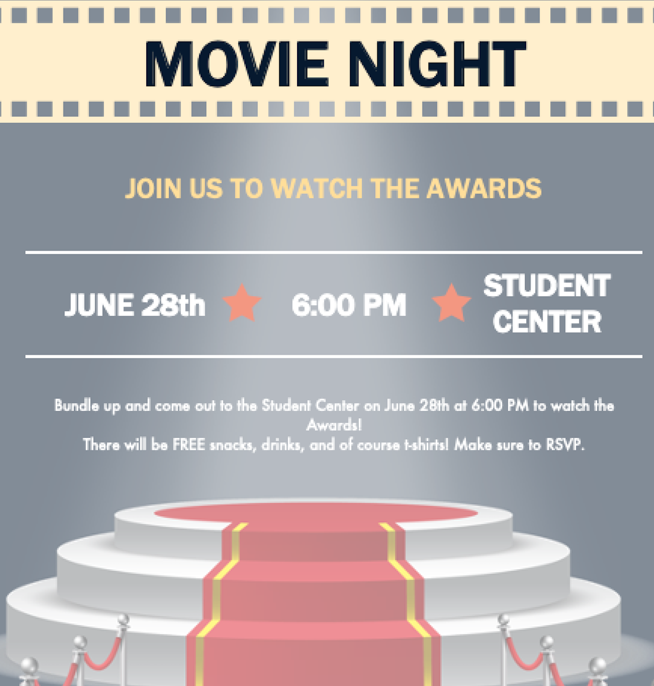
Use the Color Blindness Simulator tool to simulate what it is like to view your designs with various color vision impairments. - Do not use images containing text, flyers, or logos. Screen readers cannot “read” an image. Mobile users struggle with images of text because the lines cannot re-flow, so the browser makes it smaller. Some images of text cannot be scaled up by people with reading difficulties or visual impairments without becoming blurry.

Image of Text Example
Review the WCAG 2.1 Guidelines on Images of Text (No Exception) for a comprehensive set of recommendations. - Images should provide alternative texts for screen readers in the form of alternative text. Alternative texts should be brief (maximum of 80 characters). They should convey the purpose of the image, not describe the image. Same images can have different alt text depending on their context.

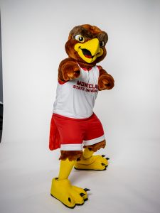
Context Alt Text Montclair State’s School Mascot Rocky the Red Hawk Machuga Heights Building Rocky in front of the Machuga Heights Building Montclair State University Residence Life Rocky ready for a tour to Machuga Heights
Don’t include “image of,” “photo of,” or the name of the file itself (e.g., “image.jpg”). Avoid using the same alternative text everywhere an image is used.
Review the WebAim’s guide to alternative text to help you determine the best alternative text for your image. - Avoid using link URLs in an event’s description. Screen readers will read each character. Instead, integrate the links as a clickable phrase. URLs may not be easily readable by humans or screen readers.
- Keep clickable phrases as short as possible while still being meaningful out of context. It will save screen reader users time, as less will require to be spoken.
Example: “Register” is preferable to “to register, please click here” - Avoid vague or generic text such as Click Here or Read More. Linked text should make sense out of context because screen readers often navigate from link to link, skipping the surrounding text. They will read each link out loud, in sequential order.
Example: If the link text is “Red Hawk Central,” the screen reader will say “link Red Hawk Central” and the user will know that the webpage linked to is likely about the Red Hawk Central. Instead, if the link text is “click here,” the screen reader will say “link click here,” and the user will have no idea what the linked webpage is all about. - Avoid linking to two different URLs using the same word or linking to the same URL using different words.
Review the WebAim’s guidelines on Links and Hypertext and the W3C’s guide to Link Purpose (In Context) to carefully choose which words to hyperlink and provide context to people without functioning vision whom may be using a screen reader or other assistive technology.
